Happy Friday!
We’ve decided to split up the bi-weekly newsletter into two parts — one part being for paid subscribers only, sharing an essay with my thoughts on different interior topics, i.e. mistakes I’ve made in design, trends I’m loving, projects I’m working, etc. The other part being for both paid and free subscribers with the 5 things, an answer to a reader question, as well as my favorite decor space I’ve seen recently. Nothing is changing for paid subscribers, other than the fact that you will now receive a newsletter to your inbox every Friday! Free subscribers, you can now expect this email every other week.
What I’ve been reading: The Marriage Portrait. Have you read it? I now want to read every single book she’s written.
What I’ve been cooking & eating: Sally Schnieder’s Slow Roasted Salmon via Food52 has changed the way I cook salmon! Let me know if you try it.
What I’ve been watching: Party Down. Would love to hear your thoughts!
What’s in my cart: This sweater from La Linge. It’s one of those “forever sweater” purchases that I have put off but know I won’t regret making…
One thing I’m looking forward to… My upcoming bookclub March 23rd! It’s my turn to host and we’re discussing Tomorrow and Tomorrow and Tomorrow (which still lives rent free in my mind).
Reader Question:
If you ever have the inkling, I’d love for you to cover bringing color into more open floor plans since color is your focus (on Wit & Delight) in March!
Kate’s Answer:
Let's start with why adding color helps with defining your space. Color can create visual distinctions throughout the room and help to break up large, open areas into distinct spaces. Additionally, color can be used to evoke certain emotions or even cue how a space should be used.When it comes to open floor plans, you have set some hard and fast rules for how more than one paint color is applied.What is an open floor plan? An open floor plan is a single, large space that combines living and entertaining areas. It has very few walls if any, and the furniture in the space should be arranged so that it creates distinct zones without blocking sight lines.In short, you've got fewer walls to work with, and those walls are almost in direct sightline to other zones.Here are two ways to approach adding color to an open concept space:
Trim in a colorful or contrasting neutral. The architectural details of the open concept space become defined and create visual interest throughout. It's a relatively simple method of application: wherever you've got woodwork (window casings, chair rails, window grilles, etc).
Paint 2-3 walls of your most "defined" space (usually a living or dining area) a color that coordinates with the furnishing in the rest of your house. It will never look exactly like a closed concept space but it will feel more defined because of the added contrast. If you have a small casing without trim, the lighter shade should be painted underneath so the two colors meet where there is a natural corner or angle.
No matter what you decide to do, keep your color palette cohesive throughout. To keep things from being to matchy-matchy, select a palette that looks like they come from the same family, which will help the transitions between the contrasting color choices look (and feel) intentional.
You can read more about incorporating color into your home on Wit & Delight here, here, here, and here. In this post, I share my favorite accounts to follow on Instagram for design inspiration!
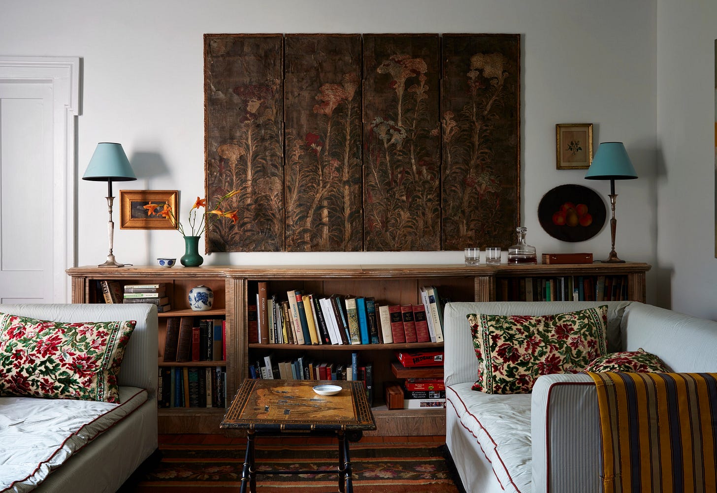
Lastly, here is the interior space that I can’t stop thinking about. “An elegant upstate New York farmhouse shot through with rustic charm,” as House & Garden UK puts it. The mix of english antiques with a casual farm house vibes has me taking copious notes.
If you have seen any particularly beautiful interiors lately, please feel free to share them in the comments. I’m also looking out for more inspiration.
Thank you, as always, for reading & supporting my newsletter. If you are a paying subscriber already, you will receive another newsletter to your inbox a week from today! If you are a free subscriber and would like to upgrade, there is a button at the bottom of this page where you can do so.


Thank you for talking about the open floor plans! You do color so beautifully so I’ll be coming back to your tips often. Also that farmhouse is to. die. for.