Kate's 5 Things
Happy Friday and Happy May! I hope these first few days of this new month are treating you well.
What I’ve been reading:
I finished Book Lovers and promptly ordered Happy Place. I’m enjoying it! Have you read either? I’d love to hear your thoughts.
What I’ve been cooking & eating:
Nothing has topped Succession. I look forward to it every Sunday. I watched Love & Death (another series on Candy Montgomery) and this HBO series featuring Elizabeth Olson has a very different feel to it. If you watched it, what did you think?
What I’ve been watching:
I haven’t been cooking much but I found my absolutely favorite wrap (the brand is Joseph’s and they are soft and fresh and so delicious!). I have been mixing and matching the ingredients I put inside. You can see some of my lunches here.
What’s in my cart:
I can’t decide which SSS x Lulu & Georgia pillow to purchase! I’m leaning towards this one.
One thing I’m looking forward to…
YARD WORK! We’re buckling down on rebuilding and scaling back the landscaping in our yard this spring. The goal is to make it more manageable for our lifestyle, while also making it a place where we can spend time outdoors and disconnect from work throughout the day.
Reader Question:
What is a color that always catches your eye in design, and why?
Kate’s Answer:
When red, specifically poppy (a slightly orangey red with a bit of brown undertones), is used well I always find myself drawn to the space. I think Beata Heuman’s dining room is a great example of how she consistently uses the color. You’ll find it peppered in everywhere but it’s never the focal point. To me, that’s just one way color brings in both layered interest AND personality.
Is there a certain color(s) you find yourself gravitating towards in design? If yes, have you incorporated it into your own home, or do you admire it from afar? I’d love to hear your thoughts!
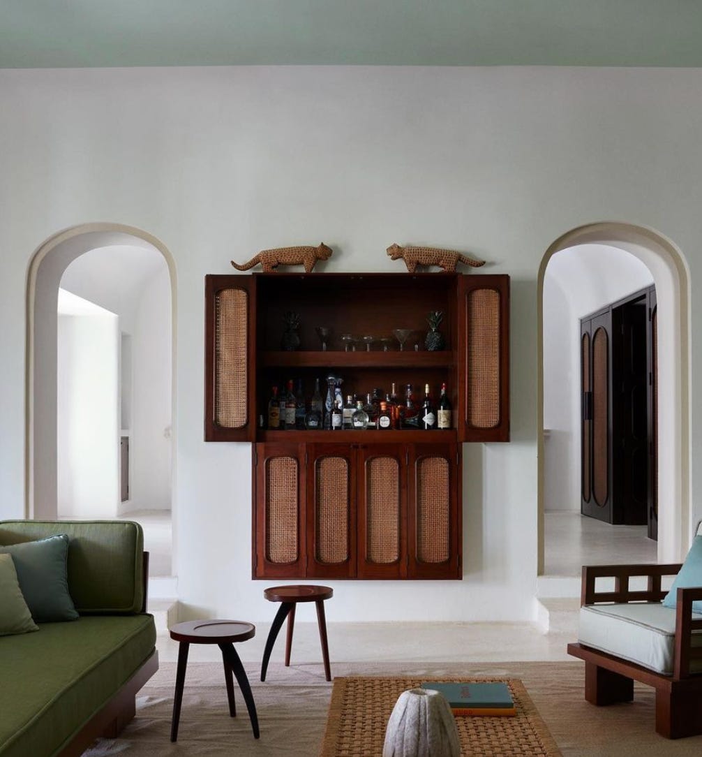
As for my favorite interior space of the week, I’ve been thinking a lot about my personal style and how it straddles this love of layered pattern and texture paired with the restraint you’d see in a minimalist space. This hotel designed by Studio Giancarlo Valle is a great example of minimalist maximalism. It had my heart thumping when I first saw it!

Thank you for reading & supporting my newsletter. If you are already a paying subscriber, you will receive another newsletter to your inbox a week from today! If you are a free subscriber and would like to upgrade, there is a button at the bottom of this page where you can do so.
Enjoy your weekend!


