Happy Friday all! We’re over halfway through May…can you believe it!?
What I’ve been reading:
I have been learning so much about how to fuel my body for my unique patterns and pitfalls, specifically around my low serotonin levels. It’s helped heal my relationship with food in a way I did not expect. I understand why people say food is medicine now. Thankful for these lessons!
What I’ve been eating:
“No Tuna” Salad Sandwich from Forks Over Knives. I make a double batch early in the week and eat it in lettuce wraps or on a sourdough crisp for lunch. SO much flavor and lots of good-for-your-brain ingredients.
What I’ve been watching:
The Diplomat – I’m only 2 episodes in but I love Kerri Russell and she’s great in it. Have you watched it yet?
What’s in my cart:
I’ve been sprucing up our back patio this week! I ordered these copper solar powered lights, this light to install above our back door, and this mat to match the one we have at our front door.
One thing I’m looking forward to…
Starting tennis lessons for the summer! What are you looking forward to over the next few months?
Reader Question:
What is your advice on how to make high-ceiling open-spaces feel cozy?
Kate’s Answer:
You’ll want to combine a few different tactics in a room that feels cavernous:
1. Create some visual height.
This can be done through hanging a large tapestry, oversized art work, tall lamps lamps, or a tall plant. You’ll shorten the space between the ceiling and the floor, or at least bring your eye up.
2. Embrace statement lighting.
A huge rice-paper lamp or large chandelier help anchor the negative space between the ceiling and furniture.
3. Use warmer colors on the walls (and ceiling!)
For example, a stark white will make a large space feel more clinical, but an ivory or warm cream feels entirely different while still feeling clean and bright. Warmer tones generally feel cozier than colors with cooler undertones! Painting the ceiling the same color as your walls also makes the room feel more intimate.
4. Bring in lots of natural materials and texture in your furnishings.
Antique wood side tables, walls of books, nubby fabrics, rugs that add warmth under your feet and dampen the sound. A minimal approach to decor will highlight the architectural features, while creating styling moments with decorative elements– be it a sofa table or bookshelf, help the space feel more lived in and less cold.
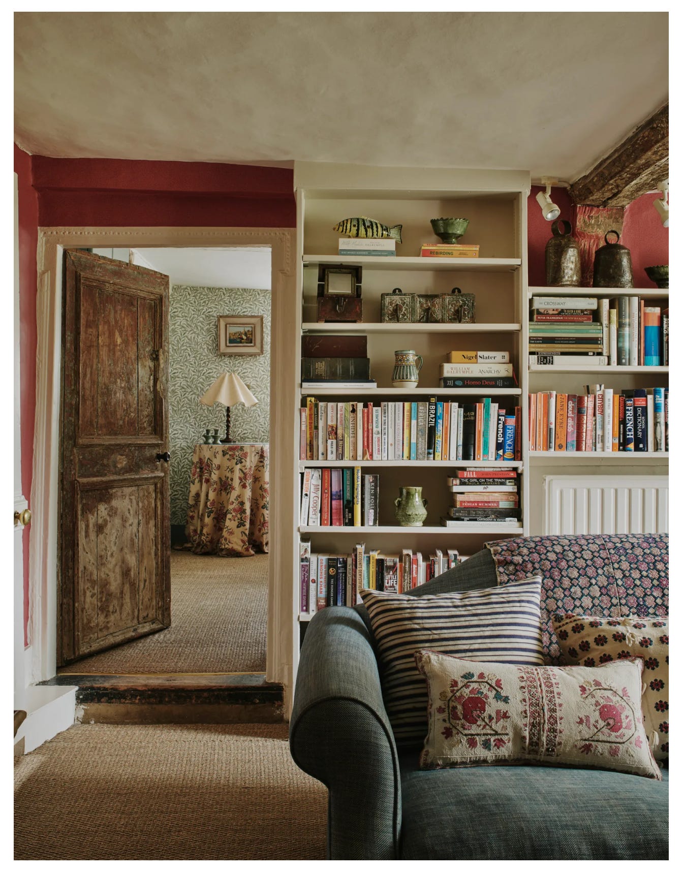
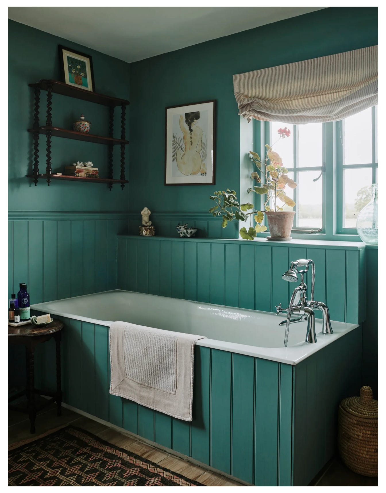
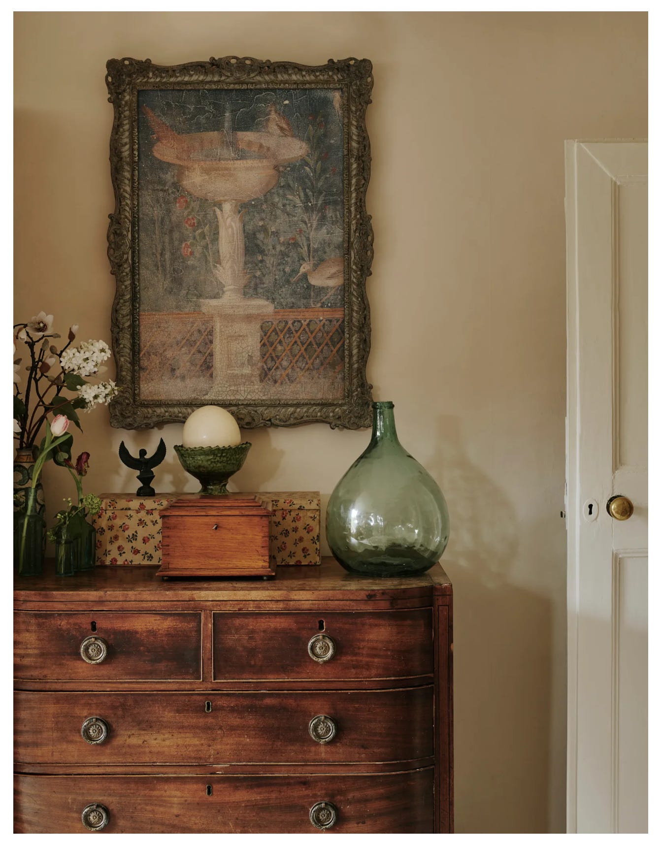
Last but not least, this cottage filled with books and color is all I can think about! What’s not to love? I absolutely love Francesca Gentilli’s approach to color and pattern.
You can see more images of her gorgeous home, shot by Chris Horwood, on House & Garden UK.
Thank you for reading & supporting my newsletter. If you are already a paying subscriber, you will receive another newsletter to your inbox a week from today! If you are a free subscriber and would like to upgrade, there is a button at the bottom of this page where you can do so.
Enjoy your weekend!


Always on the hunt for good, easy lunch ideas--excited to try the no tuna salad sandwich!